Device
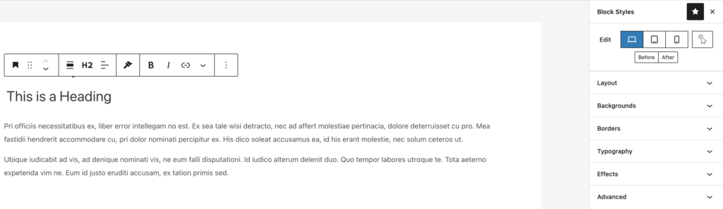
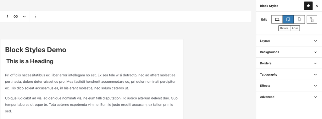
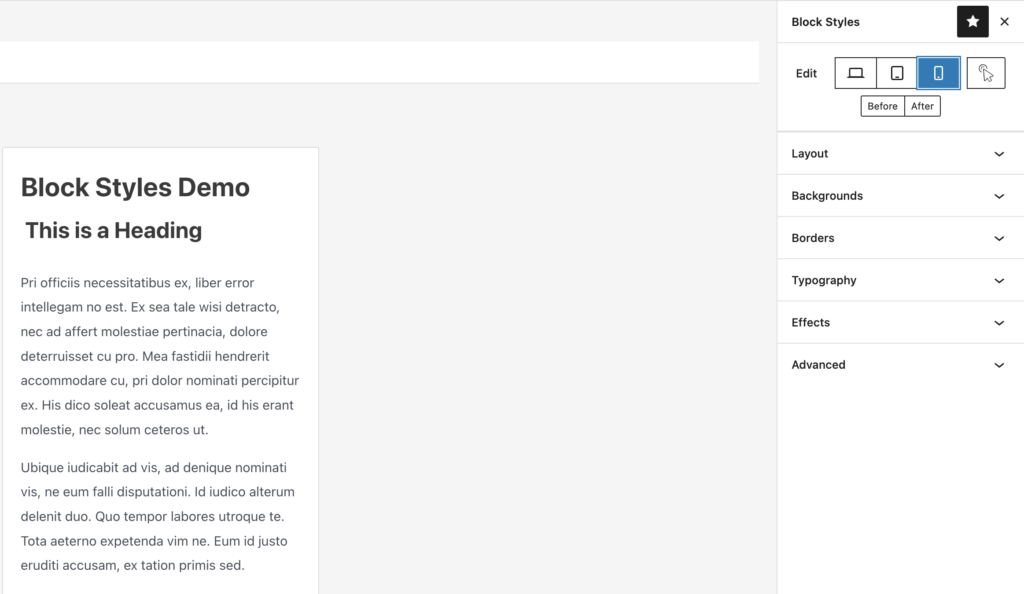
Ensure your web pages look great on all devices including desktop, mobile, and tablets. Easily toggle between devices to customize blocks and take advantage of our hover control for an alternative page editing experience.
- Desktop
- Table
- Mobile
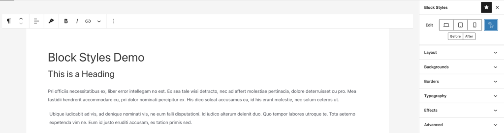
To toggle between devices, click on the Block Styles icon in the upper-right corner of the page.
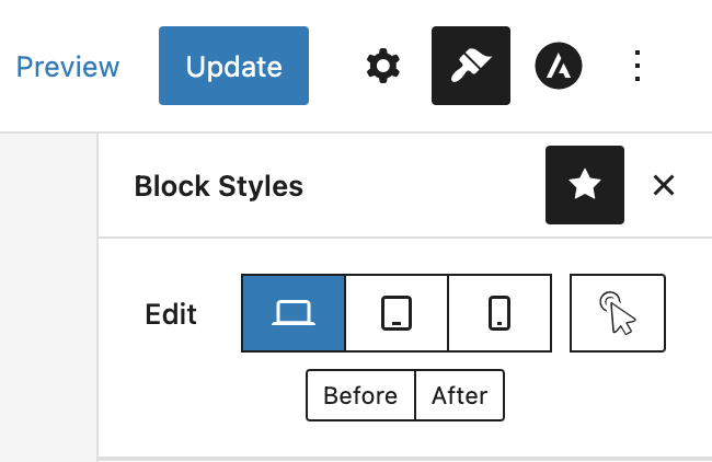
The top of the toolbar allows you to toggle between desktop, tablet, and mobile.
State-Specific Controls
- Hover
To select the hover control, click the arrow icon on the device toggle.
Custom Media Queries*
Pseudo Elements (Before & After)*
*Coming to a future release.
If you experience any issues, feel free to reach us at our support page.
Leave a Reply